Plastic Pasig
In response to the pressing issue of plastic pollution in oceans, I embarked on a journey to tell a compelling story through a data-informed website. Uncovering global data on plastic production and its impact on the ocean, I honed in on the Philippines, revealing its unexpected and disproportionate contribution to the plastic emitted to the ocean. The Pasig River emerged as a major contributor, prompting an exploration of nearby industrial cities with alarming projections of increasing plastic waste. Wireframes and mock-ups were crafted to convey the narrative effectively. Usability testing refined the storytelling, emphasizing emotional engagement and prompting tangible actions against the plastic crisis.
Deliverables
UX research, user testing, web design, web development
Team
1
Duration
13 weeks end-to-end
The Plastic Crisis
As comes as no surprise to anyone, the world and its natural habitat is rapidly changing. Harmful human activities have been damaging our oceans, forests, and atmosphere for decades upon decades. Given the sheer scale of the climate catastrophe, it is often overwhelming to know where to start, or how to thoroughly understand it. I was tasked with creating a website informed by data that aimed to combat an environmental issue. As such, this project hoped to shed light on one specific issue, namely plastic pollution in our oceans. I aimed to investigate data surrounding this problem in hopes of ending up with an elementary grasp of the issue and a starting point of how it can be tackled. I am a surfer and lover of the ocean. Ensuring its prosperity is something close to my heart.
It’s Getting Worse…
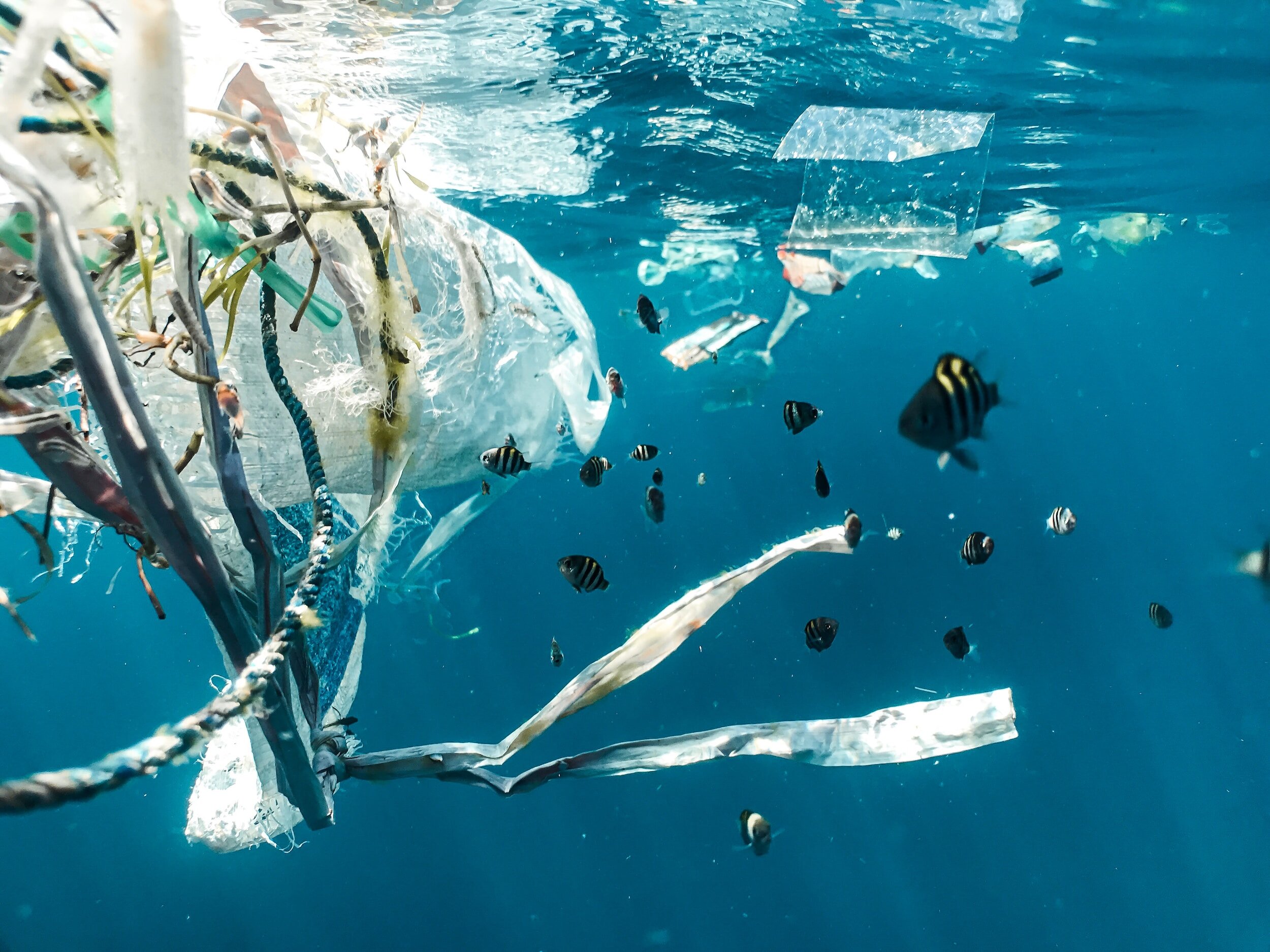
It’s no secret that plastic has been smothering our oceans for years. Photos like these have circulated the internet dozens of times and have made us acutely aware of the issue. Plastic production has been increasing at an alarming rate since 1950, and unsurprisingly both macro and micro plastic found in the ocean has as well.
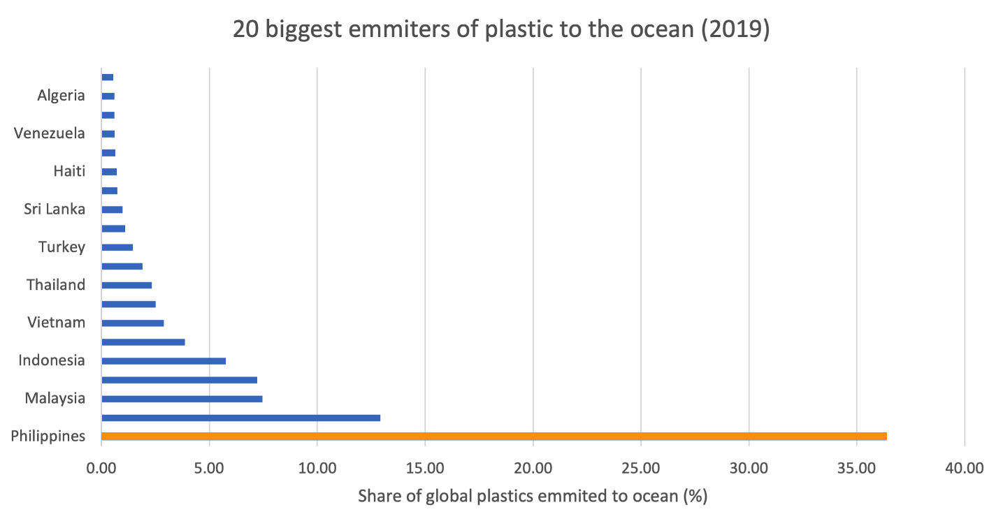
When we look at the biggest producers of plastic waste, as you might expect we find China and the US taking the top two spots. However, when we look at the biggest emitters of plastic to the ocean, unexpectedly we find that the Philippines account for over one third of the entire global share. This unexpected finding reveals the need for a more detailed analysis…
Philippines’ Plastic Problem
I began scouring datasets online and looking at what kind of story the numbers told us about plastic waste in the ocean. First, I sought to confirm/ quantify the impact that plastic production was having on plastic in the ocean. Through combining data
about the global production of plastic and the amount of macro and microplastics in the world’s oceans over time from Our World in Data, the trend is obvious.
Relevant statistics reveal the impact of this plastic pollution, with an estimated 100,000 marine mammals killed each year; with the impact on smaller organisms to be notably larger.
A deeper dive into the data, after eliminating continental values from the dataset revealed that despite being a relatively moderate producer of plastic waste, the Philippines emits a hugely disproportionate amount of plastic to the world’s oceans.
Where is this coming from?
By cross-referencing data from countries emitting the most plastic to the world’s oceans with data pertaining to the rivers most responsible for plastic pollution into the ocean, we find that 7 out of the 10 are located in the Philippines. This provides greater granularity on the issue, suggesting that perhaps this plastic being emitted into the ocean by the Philippines is getting washed into the ocean by river systems within the country. The largest of these rivers is by far the Pasig River. This one river alone contributes to over 6% of all the plastic emitted into the world’s oceans! Photos of this river corroborate these devastating statistics
Image: Phys.org
Image: AFP
So again, zooming in, I decided to collect data from the Filipino government to investigate what is around the mouth of this river. I found that Metro Manila (the city centre of the capital of the Philippines) surrounded this area, and multiple population-dense areas were situated along the river. Alarmingly these areas were all projected to increase waste generation between 2020 and 2025.
Wireframes
Given the brief to create an informative website with the data I had collected, I began to craft a narrative around the rich statistical findings from my research. I first created a set of wireframes of what the website should look like. This addressed text hierarchy, the placement of visuals and an appropriate call to action statement. Importantly, all graphical representations were decided in advance before the mockups of the website were designed.
Is It Informative?
In the first round of usability testing, five participants were given the following tasks (in order) and told to think aloud as they completed each of the tasks.
Analyse which countries are responsible for the most plastic waste in the ocean.
Ascertain which Filipino rivers are polluting a lot of plastic.
The test objective supported by these two tasks was to assess whether the visualisations chosen, coherently expressed the Philippines as the major contributor to plastic waste in the ocean and supported this through intuitive data visualisation. First of all, almost all users found the fact that there were two different chloropleth maps to be confusing. Although they were each titled individually, they fell under a large umbrella section about who is to blame. It seemed the nuance of producers of plastic vs emitters of plastic to the ocean was overcomplicated. Therefore, the first map was eliminated. Users also preferred a ‘flat’ projection of the map to inspect all countries at once.
The bar graph of the top 10 most plastic-polluting rivers in the world also seemed to confuse some users. First of all, the y-axis scale did not contain % points. This was added. Furthermore, users struggled to identify which rivers were in the Philippines, given each bar had a long label, and users were unsure about what the colour code represented. To remedy this, the country labels were removed from the axis and added on top of each bar to make it clearer.
Is It Engaging?
In the second round of usability testing, another five participants were given the following tasks. Just as before they were told to think aloud as they completed the tasks:
Use this website to take informed action against the problems it addresses. Describe what actions you are taking.
Evaluate what the website will discuss from the landing page.
The test objectives of these tasks were to assess whether users were able to immediately engage in the content of the website, and whether they felt it was easy to take actionable steps after digesting the content of the site. The second round of usability testing found that upon landing on the site, users felt like they needed to be more emotionally stimulated. In response, subtle animations were added upon landing on the page with a suitable quote about plastic in the ocean. Secondly, users felt that the last section of the website did not prompt them enough to act on the information. A small paragraph was added between the title and the charities to inform users more thoroughly about how and why to act.
Beneath The Surface
I continued to adjust the final design, including animating the graphs and the text to make the site more engaging. Please see the final animated site below.


